CAST

Data Visualisation and Benchmarking

The Challenge

Extracting Valuable Data

Visualising and interpreting assessment data is essential to communicate risk posture to senior stakeholders. Traditional paper based assessments provide point-in-time scores that are difficult to visualise and struggle to engage business leaders and key sponsors.

The Solution

CAST: Data Visualisation

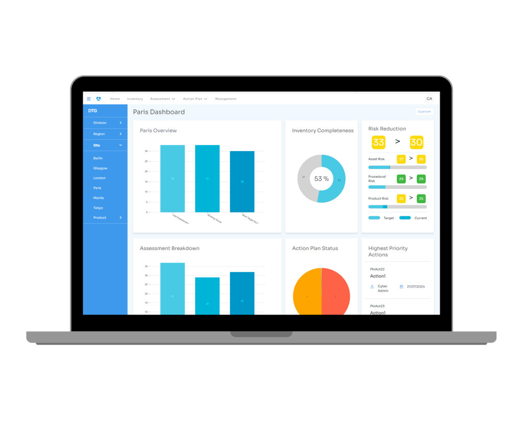
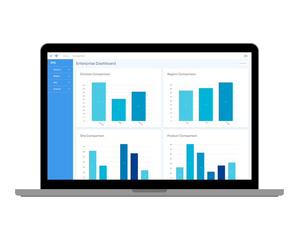
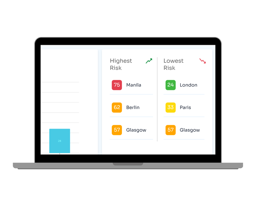
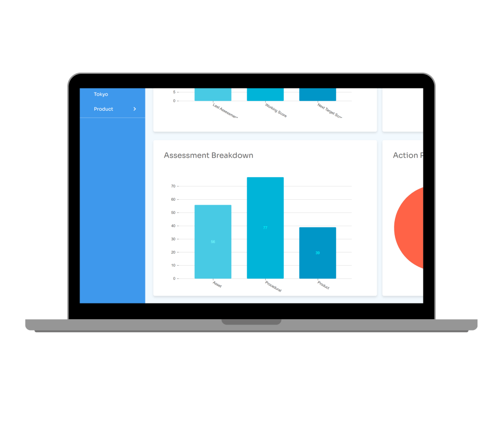
CAST displays assessment data on user-friendly dashboards that engage stakeholders at all levels – from the OT engineering team to the c-suite. Benchmark and compare across your entire enterprise or drill down to a divisional, regional or site level. Watch your score dynamically improve as risks are mitigated.

Simple dashboarding

Inventory, assessment and action plan data presented simply on graphical dashboards 

Quick comparison

Assessment scores grouped by division, region, site and product so you can easily compare across your enterprise

Colour Coded

RAG colours help to easily identify highest and lowest risk areas

Drill down

Break down site assessment scores even further to spot trends and identify key areas for remediation